Web Design
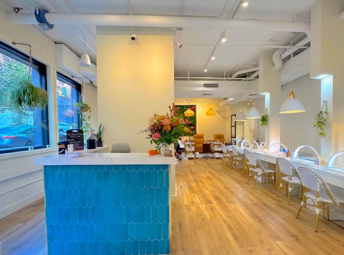
Lily & Cata Nail Saloon engaged us to elevate their online presence and better reflect the quality, care, and experience of their in-studio service. As a growing small business, their existing website lacked the polish, clarity, and visual storytelling needed to stand out in a competitive market.
APPROACH
We led a full website overhaul, reimagining both the strategy and execution from the ground up. This included a complete redesign of the site to clarify brand positioning, articulate key differentiators, and create a more inviting, trust-building narrative for first-time visitors. Alongside the written content, we developed new visual media and curated supporting imagery to create a cohesive, modern aesthetic aligned with the salon’s elevated, wellness-forward approach.
The result is a refined digital presence that feels intentional, professional, and approachable—one that accurately represents the luxurious Lily & Cata experience, strengthens brand credibility, and supports long-term growth by converting online visitors into loyal clients.
.jpg)
Retail Storefront Strategy
Exterior Brand Presence & Curb Appeal Consulting
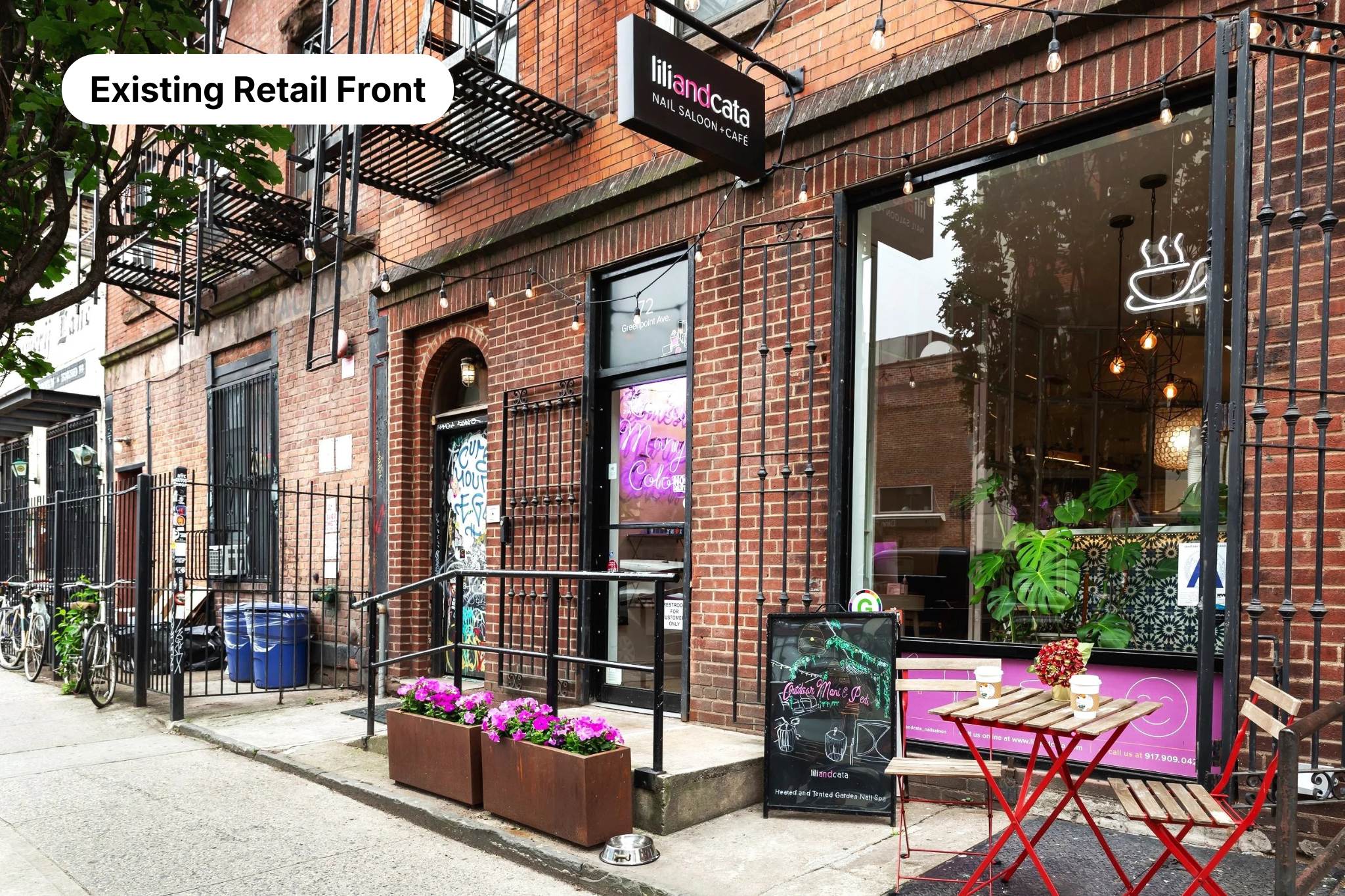
Lili & Cata is a non-toxic nail bar with two Brooklyn locations — Greenpoint and Williamsburg — offering a differentiated concept: nails, wine, and café service under one roof. The interior experience was warm, editorial, and distinct. The exterior, however, wasn't communicating that dual offering to street-level traffic. The brand's signature color, the café component, and the wine experience were essentially invisible from the sidewalk. The iron security gates — a practical necessity — were a missed brand opportunity.
The Approach
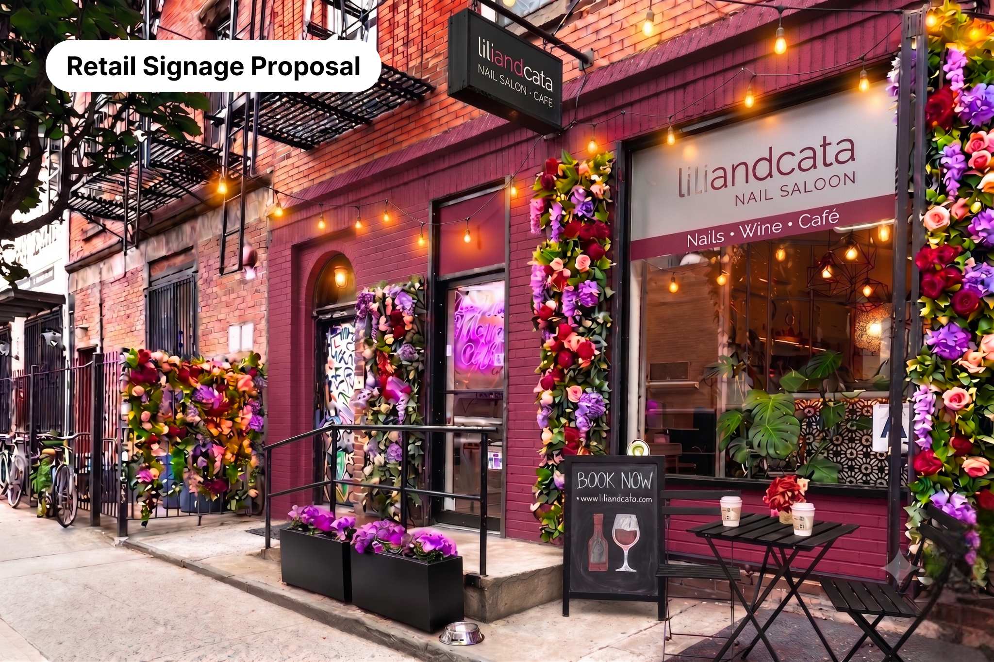
Rather than treating the exterior as a static backdrop, the proposal reframed every existing surface as a brandable asset. Four strategic interventions were identified:
- Faux Floral Gate Framing — wrapping the iron security gates in lush faux florals in brand-aligned colors (blush, magenta, violet) to transform a utilitarian fixture into a visual landmark. This creates three-dimensional curb appeal, a highly photographable moment, and an emotional warmth that signals the experience inside before a customer ever opens the door.
- Large-Format Window Clings — positioned at the top half of the window panels, above the sightline obstruction created by parked cars, to communicate the full brand offering (Nails · Wine · Café) to drive-by and pedestrian traffic at a glance.
- Brand Color Facade Treatment — framing the retail footprint in Lili & Cata's signature mauve/rose tone to pull the storefront into visual coherence with the brand identity and differentiate it from neighboring storefronts on the block.
- Redesigned Sidewalk Chalkboard — updated A-frame signage with intentional chalkboard art communicating both the nail and wine offering simultaneously, replacing generic copy with a visual hierarchy that converts foot traffic into booked appointments.
The Strategic Lens
Independent beauty and hospitality retailers in competitive Brooklyn neighborhoods face the same core challenge as multifamily properties in lease-up: the exterior is the first conversion point. Every element of this proposal was designed to do active marketing work — not just look good. The floral installation generates organic social content. The window clings function as passive advertising with no recurring cost. The facade color treatment builds neighborhood recognition over time.